No longer is using striking and bold colours a bad concept when it comes to interior design, with South Australian architects, builders and interior designers noticing an uptick in brave choices.
It’s one thing to want to live in a pink house. But it’s another thing entirely to actually go ahead and create one.
But this is what Adelaide architect – and director of Rad-Studio – Chris Rowlands did in conjunction with his clients (and friends) Adam and Chloe when they renovated their coastal home.
Chris explains that when Chloe found out she was about to welcome her second son, the planned renovation included the brief to add a feminine touch to the home to “calm everything down” and address the gender imbalance.
“So, the request was for a pink house,” Chris says. “We were in my office going through colour swatches looking for the right tone, when we stumbled across a perfect array of pinks that in the direct sunlight gave the appearance of skin blushed by the sun. Then, as we moved the swatch into the shade it gave the illusion of speckled bronze tones, as if it was tanning off; tones just perfect for a day at the beach.

This striking Rad-Studio project on South Australia’s Fleurieu Peninsula is called “Sunkissed Higgins” for a reason: its bold use of an array of pink tones that mirror the rising and setting sun. Photograph David Sievers.
“Chloe then asked, ‘So, which pink do you think?’. To which I replied: ‘All of them!’. Using the weatherboard exterior of the home as a module, we replicated the eight-bit digital sunsets of the 1980s, referred to as a Vaporwave (interpreted here as an ascending fade-out of colour).”
But, as Chris explains, there was a difference between wanting to do it and then actually doing it.
“When the time came to paint, there was some freaking out, not only by Adam and Chloe, but also a little uncertainty from neighbours at first: ‘Are we actually going to paint this house six different shades of pink?’.

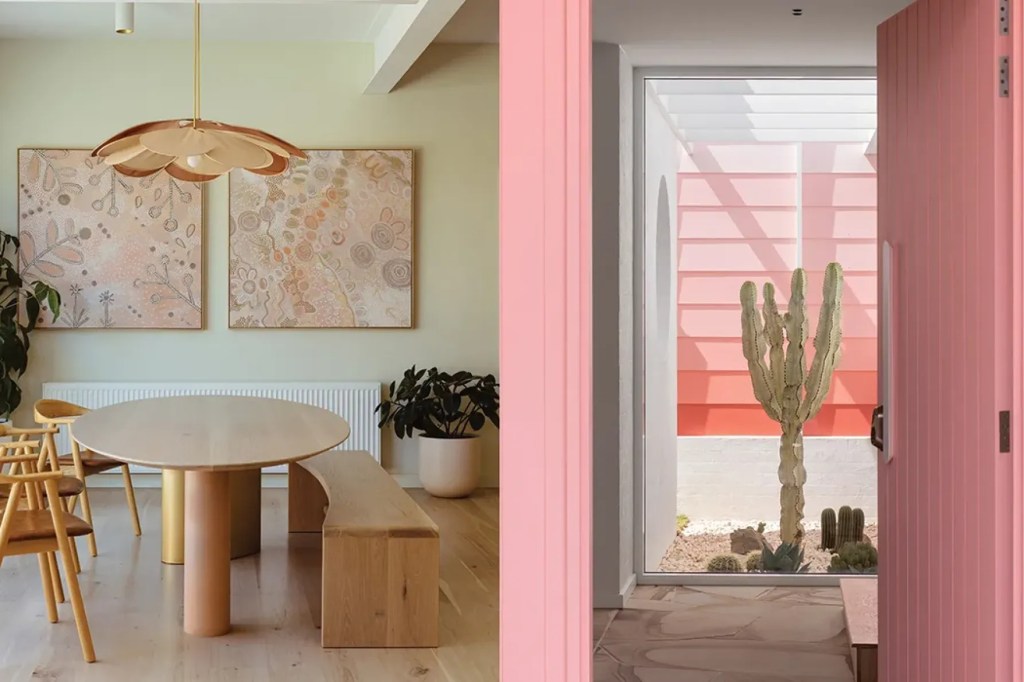
The laundry in the Clinker House is a riot of burnt orange and terracotta. Photograph Jonathan VDK.
“Both Chloe and Adam put trust in the process and have been brave enough to see their house – referred to as Sunkissed Higgins – come to life through colour, giving the home an intrinsic sense of place in the small surf community.”
You might like
Today, this pink home sits on South Australia’s Fleurieu coast as a stunning example of the impact of colour. In fact, making bold choices in colour is becoming something of a trend in itself.
South Australian architect, Sally Wilson – who is the director of Archaea Architects – has recently completed a renovation in Adelaide’s southwestern suburbs, which she has coined “Clinker House”.
“Much like the lollies we once enjoyed, Clinker House is a home not shy of colour,” Sally says. “It’s a juicy delight of furniture and art curated in harmony with one another, and a reflection of the joyful family that calls it home.”
Sally explains that colour has been used deliberately across the home’s spaces to achieve one of three things: to either emphasise, contrast distinctly, or tonally reference the Indigenous art that has been collected and displayed throughout the house.

Upon entering the Clinker House you are greeted with a peach-painted archway defining the move through to the formal living room. Photograph Jonathan VDK.
“Internally, ceilings were left white, but walls have been painted in a light green tone called Garlic Suede to contrast with the vertical planes,” Sally says. “New supporting exposed steel has also been painted white, but dark timbers have been either removed or painted in lightening pastels.
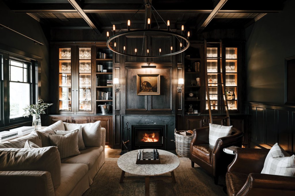
“Entering, you are greeted with a peach painted archway that defines the entry to the front formal lounge, which has made a real statement. In here, all vertical elements and walls have been painted in a dark Forest Green, which enhances the monochromatic Indigenous art displayed in the front lounge. The existing bookshelves and fireplace are all colour-blocked in Forest Green. This helps reinforce an overall soothing palette and allows white fabrics to stand out.”
Sally says that in the wet rooms, colour has been introduced in the way of finishes.
“The reconfigured bathrooms are laden with natural materials in terracotta, terrazzo, and travertine all bursting with texture and colour, while the laundry and office spaces make use of burnt ochre and Moroccan clay laminate, contextual to the displayed artwork,” she says.

The formal living room of Archaea Architects’ Clinker House is as striking as it is bold: with all vertical surfaces — whether they be brick, bookcase, fireplace or door frame — painted in a dark Forest Green, allowing lighter interior colours and textures to stand out. Photograph Jonathan VDK.
“Then there are large picture windows which are highlighted with bench seats lined in Peach-Fizz tones and the kitchen is defined by its pink Pavlova terrazzo and green laminate paying homage to the home’s original 1930s architecture.”
Sally says what allows homeowners freedom of palettes in rooms that might otherwise be bland and lifeless is the vast array of laminate colours available in the modern-day market place.
Subscribe for updates
“For example, the laundry in the Clinker House uses both natural terracotta and travertine in conjunction with the Burnt Ochre and Moroccan Clay Laminex palettes,” she says.
For Marcus Syvertsen – creative director of interior design firm, Little Road – his team and he were overjoyed when working on a bathroom project in McLaren Vale where the brief from the clients was simply: “no grey!”.

The formal living room of Archaea Architects’ Clinker House has all vertical surfaces painted in a dark Forest Green. Photograph Jonathan VDK.
“Embarking on this project ignited a wave of excitement within our design studio,” Marcus says. “When the client’s only stipulation was no grey, it was like a breath of fresh air. This directive liberated our creativity, allowing us to fashion a bathroom space that was truly exceptional.
“We ventured into the realm of colour and pattern, weaving together elements that reflected the unique personalities of our clients. The result? A captivating blend of a custom-made jarrah timber vanity set against a backdrop of rich blue matte and gloss tiles, accentuated by the subtle elegance of copper tapware.”
Marcus says he’s noticing that his clients are becoming more open to using colour and pattern in more areas of their homes.
“This is strongly encouraged early on in our concept phase and we love to challenge our clients to really explore colour and the feeling it can evoke within interior spaces,” he says. “Colour doesn’t always have to be bold, bright, and polarising; it can be muted and soft.

Large picture windows are highlighted with Peach Fizz-lined bench seats. Photograph Jonathan VDK.
“Some clients are leaning in on the biophilic design trend, which is helping with this exploration of colour and tone, referencing the outdoors with the use of natural materials, greenery and increased natural light.”
Chris says what he loves most about colour is that it helps give a space a real identity. “We’ve seen plenty of the same types of spaces ‘refreshed’ with neutral tones, but colour gives a home something to say,” he says.
“It can create an emotive quality in a space by recalling memories of the past or providing a certain type of energy to contribute to the broader local community.”
He says green is one of the colours making a real comeback in residential homes, particularly seen as a lighter olive or as sage tones.

Interior designer Marcus Syvertsen, of Little Road, was overjoyed to work on this bathroom, which came with a simple brief from his clients: “no grey!”. The result was a gorgeous mix of blues and deep wooden tones, which ventured into geometric patterns as well. Photograph Swell Studio.
“There seems to be an appreciation of some of the heritage schemes, but applied in slightly softer and contemporary applications. Don’t be too surprised if some type of orange or browns start to reappear here and there reminiscent of the 1970s. I’m not suggesting Mission Brown is on the way back, but perhaps some inspiration from that era (and what an era!).”
Chris says colour is also being splashed throughout homes thanks to dark and rich tones in marble and stone.
“I love a space with some serious mood, tone, texture and natural light,” he says. “We are seeing some really dark and rich marble and stone used to create evocative spaces, particularly for wet areas.”
This article first appeared in the 2024 issue of SALIFE Premium Property magazine.
