North Adelaide renovation lets in the light
A light-filled renovation of a century-old North Adelaide villa has given the grand old home a new contemporary, modern feel that will stand the test of time.
Around the time the calendar ticked over to 2020, Dr Andrew Lavender began to notice that his much-loved, century-old North Adelaide character villa was beginning to look somewhat dated. He’d lived in his home since 2002 and almost two decades on, he knew it was time: his grand old house needed a new lease on life.
Andrew started reviving his home by engaging the team at Proske Architects, who cleverly designed a renovation at the back of the villa that would not only give the house the lift it so desperately needed, but would fill it with light, texture and modern convenience.
The plans saw the pokey rear of the home demolished, to be replaced with an open plan living, kitchen and dining area (built over the top of the existing large underground cellar), the space bordered by steel frame windows and doors that give a seamless indoor-outdoor lifestyle. The pool and courtyard areas were also to be upgraded, along with the ensuite bathroom and powder room.
The rear extension would be designed around a 4.8-metre-long kitchen island; a veritable sun that the rest of the home’s elements could orbit around.

The stunning kitchen was designed around the long island, which features both the induction cooktop and sink as well as plenty of drawer storage space underneath. Beyond, the integrated appliances, including French door fridge and bar, have been completed in a darker, contrasting tone in Deep Leather.

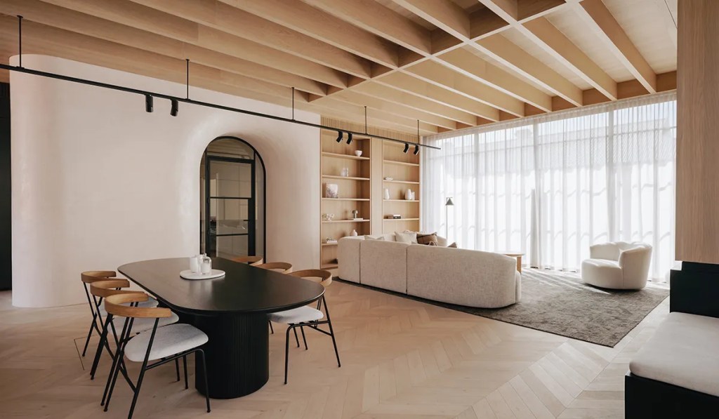
The batten ceiling has been completed in European oak, while the nearby gas fireplace has been set into steel bespoke made by Customised Metal Fabrication.
Next, came the builder: Craig Linke Bespoke Building and a 16-month, highly technical build began. Managing director, Craig Linke, says he was excited by the prospect of the renovation project from the moment he saw the initial drawings.
“They were really sleek designs, it was contemporary, nice and clean and sharp,” Craig explains. “This build was extremely technical to begin with, but then you’ve got the 100-plus-year-old house sitting at the front. So, you’re trying to prop up 100-year-old walls that are crumbly and brittle and then salvage them so you can use the external facade to save that heritage. Then you’re trying to work over the top of a 100-year-old cellar, where the challenge was to be able to hold that up underground while putting in all of the new structure.
“This meant that the initial stages of demo were very important, and that’s probably one of the biggest challenges of this build, because if you don’t get that right, you’re on the wrong path.”
You might like
But despite the challenges, the result is spectacular: from the clever batten ceiling made from piccolo plank floorboards in European oak, to the chevron laid parquetry floorboards in light Graupa, both of which create interesting visual angles and lines.

The living room’s bookcase matches the ceiling timber in European Oak. The textured black of the Unios track light on suspension rods creates even more visual interest.

The Arabescato Vagli marble makes a strong interior design statement.
Then, the black gallery-style ceiling lights hung from suspension black rods, black granite Oliveri sinks and matte black tapwear and nearby fireplace all curate a contemporary feel.
Modern convenience abounds: from the automation of the electricals thanks to SONOS and Apple, to integrated Bosch appliances and Somfy blinds.
But it’s the Venetian plastered, curved archway that delineates the transition from the old villa into the new addition, through an arched steel-framed door that enters the living area that is surely one of the stunning heroes of the renovation.
As Proske explains: “The curved entry acts as a portal between spaces, effortlessly melding old and new. The result is a harmonious fusion of the classic charm and the contemporary design, offering an inviting and functional home, perfect for entertaining or simply enjoying its surroundings.”

While the ageing pool has been given a modern facelift with white tiles and limestone tiles surrounding; distinctive steel framing has been completed in micaceous black.

The courtyard has been entirely remodelled to make the most of the light.
Equally, the use of striking marble – in its warm Arabescato Vagli colour – is a bold and confident choice.
“The marble is one of the outstanding features,” Andrew says of his home. “The choice of marble was originally discussed during the design phase, but to see it in the space, it’s such a beautiful marble and such a large expanse of it and carrying it through into the powder room and ensuite bathroom, it’s beautiful. And with the kitchen island bench – it’s 4.8 metres long and 1.2 metres wide – so it’s a beautiful space.”
Craig Linke’s project manager Luke Stewart agrees that the marble is a standout feature.
Subscribe for updates
“It’s a pure statement piece,” Luke says. “A standout wow factor, as soon as you walk through the room.

The powder room features tumbled finished Travertine wall tiles, sourced from Perini Tiles, in both the Crema Finger texture and Crema 98 finish; the powder room’s basin and bench seat have been made of the same marble finish as the kitchen.

“And then that we follow the marble through into the ensuite bathroom’s vanity unit, and we’ve had a custom mirror made that matches the European Oak joinery in the vanity unit, it all just ties together beautifully.
“Those details were part of why this project took the amount of time it did: the curtains with the cavity that it all tucks in behind the joinery, and the ceilings with the oak finish that matches the chevron floors, it takes months in the process to achieve and get the finish that we’ve got here.” The kitchen bench was designed deliberately with an induction cooktop – complete with pop-up extractor fan – because Andrew wanted to be able to cook while also facing out into the living area.
“I didn’t want my back to the room, so we’ve got the induction plate in the middle of the island with a rising extractor fan, so we don’t have an overhead rangehood, which means, in general, if I’m cooking, I’m facing into the family room and able to talk to people. It’s also allowed this space to have very clean lines and it’s a very functional space. I look forward to coming home, I look forward to cooking in the kitchen.”
Andrew describes his renovated home as being “a very uplifting space”.

The remodelled pool, with limestone coping and glass pool fencing.

Steel frame doors and windows make the most of the natural light that is now able to stream through the home.
“Beforehand, it was quite a substantial space, but now we’ve opened it all up. One of the problems we had here before, was that at some stage, a bullnose verandah extension was put on to the east side of the house and that made it quite a dark room, the kitchen felt quite dark, and so, the idea of bringing in that eastern light in the morning and that northern light in the afternoon, really has made a big difference and has opened up the space.
“It gives full justice to the ceiling height, and we have a lot of window space here and it’s an uplifting space.”
Andrew was handed the keys to his renovated home two days before last Christmas and it was a joyous occasion.
“We had family here, without much furniture, but it was a 23-degree day, we were able to open up all the windows and really, the whole renovation became an indoor-outdoor space and it was a beautiful way to use it that first time.”
In fact, Andrew couldn’t be more pleased: “Given it’s an older house, I always knew there could be problems with old bluestone footings, old ceiling timbers and a whole lot of potential complications … but it’s great to see the house I’ve lived in since 2002 that gradually became tired and you could see the flaws and it needed some love and attention again; it’s great to see it brought back to life.”
This article first appeared in the 2024 issue of SALIFE Premium Property magazine.
