Mid-century architecture: The Walkley Residence
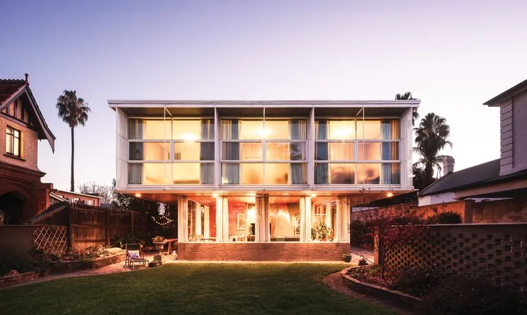
Fiercely modern in its day, this North Adelaide home has been passed down the generations of one family, and continues to draw stares from the street.
Words Zoe Rice | Photographs Matt Castle
When she’s in her beautifully-kept North Adelaide front garden, Raphaela Oest often overhears passers-by commenting on her home.
“It’s our home and it’s quite normal to us, but it’s something unique to many other people,” Raphaela says. “I hear them gasping on the other side of the fence as they walk past.”
One couple even left a note in the letterbox, asking to get married on the lawns. The wedding went ahead and the couple’s gift to their guests was a mug decorated with a sketch of the home.
At the gate, an oval plaque hints at a rich history while, within the walls, Raphaela and her mother Jane chat about the life of the Palmer Place home over three generations.
When it was built in 1955, the Walkley residence – commissioned by Raphaela’s grandfather, architect Gavin Walkley – began to shift the way people saw design in Adelaide. Surrounded by significantly older buildings with heritage value, the Walkley residence was revolutionary with its steel framing and walls of windows.
An active member of the Architects Board of South Australia and the Royal Australian Institute of Architects, Gavin had an eye for modern design and had the home built on the land, which he purchased in 1947. The original 1848 cottage on the site was damaged in an earthquake and he set about designing something new and spectacular to replace it.

Raphaela Oest (middle) and her husband Simon are the current custodians of the Walkley residence. They moved in late last year after Raphaela’s mother Jane (left) moved out.

The stunning cork and copper staircase is a statement upon entry.
When renowned architect Robin Boyd remarked that if ever Gavin was looking to build again, he’d like to be the one to design it, Gavin extended an invitation to the Victorian-based architect. What ensued was detailed correspondence, which remains in the home today, in the charming in-built filing system in the study.
The interior was the creation of the most renowned interior designer of the day: Marion Hall Best. In a letter to Lady Hall Best, Gavin wrote, “The design is mainly Robin Boyd’s. I merely interfered at intervals and made a nuisance of myself.”
He was being modest, with letters going back and forth between the pair showing them bouncing ideas off each other. Their communication covers everything from the design of the copper fireplace – a hallmark of Boyd’s – down to the height of the light switches, with hand drawings at the bottom of pages showing details and measurements.
You might like
In one letter, Boyd writes, “I’m glad to hear that work is progressing quite well, and that can’t be fast enough for me because I couldn’t be keener to see it take form. I’ve got a feeling I’m going to be very pleased with this building. Sometimes an idea seems to go stale even before the working drawings are finished. But this one seems to me to have improved if anything. At any rate, it gives me secret pleasure to look at the drawing, because it all looks so simple and workable. I only hope that it proves to be entirely as livable [sic] for you as intended.”
Habitable it was, and continues to be. The now heritage-listed home is testament to a moment in time when creativity and modernity were burgeoning, but in no way is it a museum.
It has retained its liveability throughout the decades for each of the three generations of family ownership, adapting in the smallest of ways with every new occupant. Jane remembers sweltering summers and icy winters so, when she became head of the home, she eventually had air conditioning installed.

The stunning copper fireplace keeps on giving; it extends through the upper storey, where it heats the bedrooms, ending in a domed skylight.

Sitting in the living area, it’s clear to see how the home would heat quickly under a glaring summer sun. Grand windows look out to a charming front lawn with sweeping curves, and beyond to the Adelaide Hills.
It was designed with the view in mind, oriented east-west to take in the landscape. The bedrooms on the second storey sit atop the living space, and they too feature expanses of glass.
Jane remembers visiting the building site as a child every weekend, watching the timbers, steel and glass slowly take form into her home, which she says her father was delighted with.
“He was extremely proud of it,” Jane says. “The garden
was professionally designed and Gavin maintained it meticulously himself.”
The property had belonged to Elsie Marion Cornish, a renowned landscape gardener and she kept her nursery there. Some of her plants were incorporated into Gavin and his wife Barbara’s garden.
Having a home such as this in the family creates a sense of responsibility, but it’s a custodianship that Raphaela and her partner Simon have taken on with aplomb. Raphaela had called the residence home for not quite a decade as a teenager, but when her mother moved out late last year, she and Simon moved in.

There’s no greater outlook in the home than the living space, with views of the garden and out to the hills.

Simon says there are only two things in the home that aren’t straight lines and right angles – the fireplace and the staircase. “The fact that you can make something a feature just by having a diagonal line, I think is a credit to the design,” he says.
In the living room, the copper fireplace immediately draws the eye, surrounded by a subtle olive and warm-toned brick. The flue extends right up into the landing of the second storey, heating the upper level, finishing with a domed skylight that brightens the area.
Cork floorboards mirror the tones of the meranti timber ceiling and continue up the staircase, with a copper handrail extending to the second floor.
Subscribe for updates
“You see features in this house that are now becoming popular in ultra-modern designs; the overhanging soffits, the outdoor timber ceilings, recessed lighting. They’re things that are being called modern features now, but actually, they’ve been used for a long time. This is the original,” says Simon.
With a home that carries such character, there can often be an urge to perfectly balance history with contemporary living, but in this home, the scales favour the original plan. Modern touches have been added with a light hand in the most subtle of ways.
In the kitchen, Raphaela and Simon preferred drawers, but didn’t want to interfere with the cupboards, so they had drawers installed behind the original doors.

The kitchen, complete with a 1969 oven, is resplendent in Dulux Deep Brunswick green.

The study still holds all the correspondence between the home’s original owner, Gavin Walkley, and his suppliers.
The history is celebrated in this particular room, with the Simpson Fabulous 400 oven, complete with a plate warmer, making a striking centrepiece. Having been installed in 1969, a back-up plan was needed for spare parts, and the couple found it on Facebook Marketplace in the form of an oven of the same model being sold by a family renovating their mid-century Adelaide Hills home.
The sink, which bears the inscription of Barbara’s parents’ address in Melbourne – where it would have been delivered – was bought as a wedding present for Gavin and Barbara.
The most obvious alteration to the kitchen was carried out by Gavin, a daring lick of Deep Brunswick Green paint, which covered the original all-white woodwork.
He clearly wasn’t afraid of using bold tones; doors, walls and ceilings throughout the home vary from chartreuse and olive to maroon and teal blue. Surprisingly, nothing clashes, instead working harmoniously to achieve a rich palette.
Raphaela says she had a painter in to quote a re-touch and he was surprised at the number of colours in the home. “I never noticed,” she says. “When you bring other people in, they see things differently.”
Marion Hall Best was known for her flamboyance with colour, and while the choices were certainly pushing boundaries, she tried to push further with hot pink, but Gavin vetoed that. Although, the designer noted in one letter that the house speaks for itself. “The beauty of your house is that it is so lovely in itself, the less furnishing it has the better,” she wrote.

The timber, glass and steel structure was revolutionary in its day.

Simon and Raphaela are honouring the home’s history while ensuring it’s liveable for them.
Perhaps the most elaborate decoration added to the home is a pair of regal-looking portraits of Gavin and Barbara.
Raphaela and Simon have kept the decor simple, letting the house sing on its own, as it was intended to – the only upkeep really needed was a replacement of some of the cork and a little upgrade of the bathroom and kitchen.
“It’s a credit to the quality that we’re only needing to tackle some jobs now,” Simon says.
“We had the mindset of keeping it as original as possible and not to go changing everything. We couldn’t, but we don’t want to either – that’s part of the journey and the custodianship.”
As much as Raphaela says the house feels normal to her, she is acutely aware of the importance of preserving and sharing the legacy.
“I love it and I feel incredibly fortunate for us to have this life and this opportunity,” she says.
“It’s about understanding what it meant for Gavin and being able to share it with other people. I think there’s a sense of responsibility to share that story.”
This story first appeared in the October 2021 issue of SALIFE magazine.
